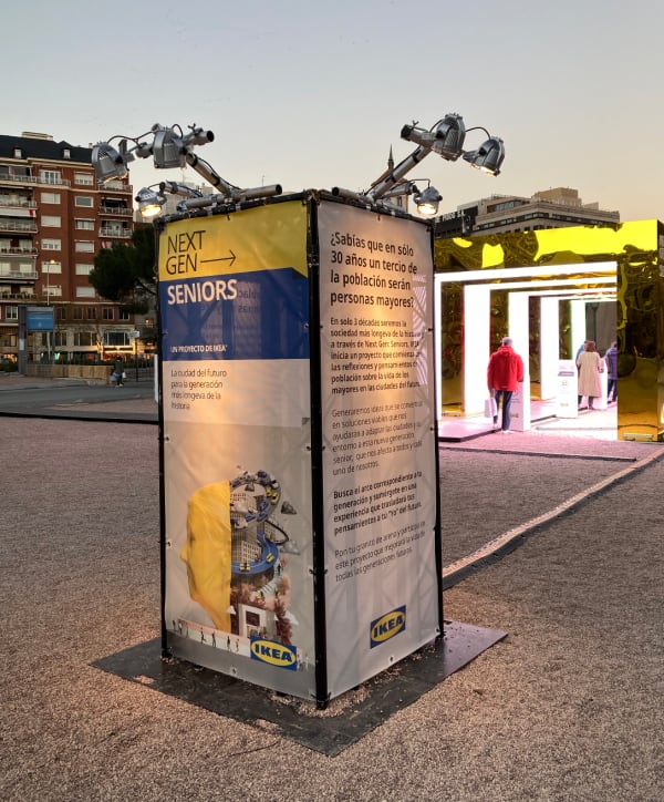
IDEA
Hemos diseñado una instalación de DATA ART interactiva a tiempo real en la que invitamos a las personas a que vivan una experiencia inmersiva y emocional, para abrirse a reflexionar sobre el envejecimiento consciente y activo de las ciudades.
La instalación está diseñada, como un CANAL DE ESCUCHA, donde las personas se aproximen con libertad y mente creativa a un tema del que se habla muy poco, que es el envejecimiento de nuestras sociedades y por lo tanto nuestras ciudades.
Además es también una instalación donde se visualizan a tiempo real todos los datos recopilados a partir de las respuestas y opiniones de las personas que participan en la instalación, traducidas en COLOR.
En esta instalación el uso del COLOR como protagonista, nos ayuda a mostrar de una manera CREATIVA y SENCILLA el estado de interés y la percepción que tienen las personas con respecto a su futuro SENIOR.
En qué consiste
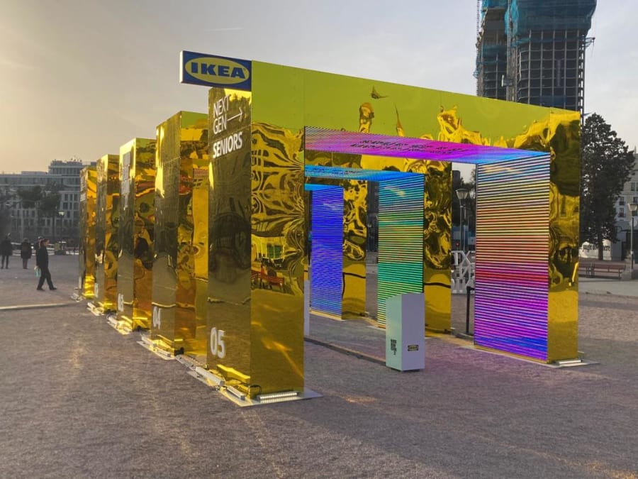
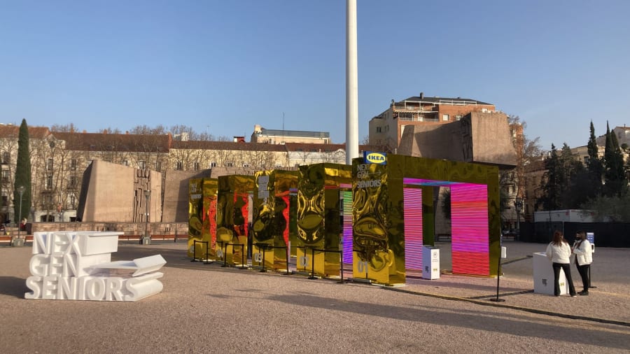
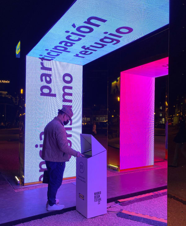
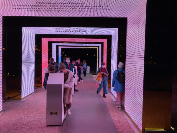
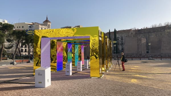
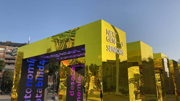
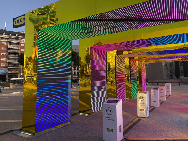
En esta instalación nos encontramos con 5 arcos de pantallas, que se corresponden a 5 décadas, o 5 tramos generacionales diferentes. A modo de túnel del tiempo, cada arco acoge a las personas que durante estos tramos temporales específicos (esas décadas) cumplirán 65 años.
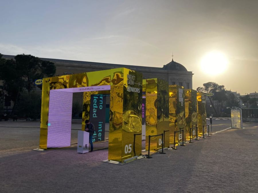
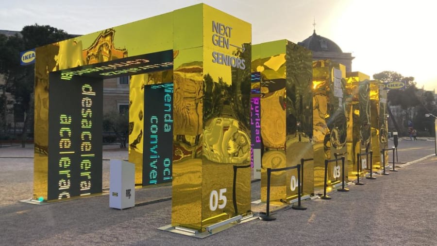
La interacción es muy sencilla: el usuario se posiciona en el arco que le corresponde según su edad y allí encuentra una pantalla táctil, donde responderá a una serie de preguntas que tienen que ver con su percepción sobre el envejecimiento activo y consciente de las ciudades.
El análisis de sus respuestas se traducirá en un COLOR, que es lo que hemos llamado metafóricamente “el color con el que ves tu futuro”. Además el/la visitante podrá ver también cuál es el COLOR DE SU GENERACIÓN y con ello observar cómo de afín o no afín está en su percepción del futuro SENIOR, con respecto a su misma generación.
Cómo funciona
Todas las preguntas están categorizadas en tres temas de interés: SOCIAL, TIEMPO y ENTORNO. El sistema que hemos desarrollado traduce la percepción +o- positiva y +o- negativa de cada usuario en cada uno de estos temas en un nivel de Rojo, Verde y Azul, componiendo así un color único que representa su visión. Cada participante obtendrá un color individual en base a sus respuestas.
Y a partir de la combinación de diferentes colores de usuarios correspondientes a la misma generación creamos el color medio de cada generación.
El usuario no solo podrá ver su COLOR y el de su generación sino también tendrá acceso a los porcentajes de cada una de las tres categorías a las que ha ido respondiendo en las preguntas y comparar sus resultados con los de la media de su generación.
Cada pregunta pertenece a una categoría y a cada categoría le hemos asociado un color del RGB. El RGB como sabemos es un término que se compone por las siglas de los términos “red”, “green” y blue”, es decir, rojo, verde y azul, es decir, son los 3 colores primarios con los que se componen todo el resto de colores. Es decir, nuestro sistema analiza todas las respuestas de un individuo y calcula el color resultante.
---
The installation at MDF22 consisted of a real-time and interactive data visualization showing how different generations in Spain perceive their future concerning the themes drawn from the research. It represented a dialogue with society through design solutions that can soon allow for the configuration of friendlier, safe, and more functional spaces in homes and cities.
We designed an interactive real-time data art installation. We invited users to live an immersive and emotional experience. To be open and reflect on the conscious and active aging of cities. It is a listening channel where people could freely and creatively approach a subject rarely spoken of, specifically the aging of our societies and, therefore, our cities.
The installation translated data collected from the responses and opinions of research participants into colour, which we then displayed in real-time. Colour is the protagonist. It helps us show, creatively and plainly, the state of interest and the perception that people have regarding their future senior.
Five arches of screens corresponded to five decades or five different generational sections. Like a time tunnel, each welcomed users who were going to be sixty-five during these specific periods. Users positioned themselves under the arch corresponding to their age. They used a touch screen to respond to questions about aging in cities. The analysis of their answers resulted in a color, what we metaphorically called “the color with which you see your future.”. They could see the color of their generation and observe how related or unrelated they are to their perception of the future senior, as related to their generation.


There are three topics of interest: social, time, and the environment. The system we developed translates the +o- positive and +o- negative perception of each user for each of these themes into a Red, Green, and Blue level, resulting in a single color representing their vision. Each participant had a specific color that reflected their answers. By combining the different color combinations of users in the same generation, we created the average color for each generation. They could view their color and know the percentages of each of the three categories based on their responses, and compare their results with those of the average for their generation.
Each question belongs to a category and we have associated an RGB color with each category. RGB, as we know, is a term that is made up of the acronyms of the terms “red”, “green” and blue, that is, red, green, and blue, that is, they are the three primary colors with which everything is made up the rest of the colors. That is, our system analyzes all the answers of an individual and calculates the resulting color.
We seek to arouse interest and reflection through a visual and sensory experience about a subject that affects us all, specifically, the aging of our societies. In this installation, we do not judge or evaluate people’s opinions. We make visible, creatively and emotionally, their interests, perception, and concerns regarding old age and relate this information to the different generations.
Client: IKEA
Agency: Dentsu
Venue: Madrid Design Festival
Production company: Espadaysantacruz Studio
Development: Crowtec
Visuals Art Design: Tres Tipos Gráficos
Powered by: Open AI, Amazon Comprehend, Python, OpenFrameworks, Node.js
Feb - 2022